PROJECT:
Geronimo Steakhouse
ROLE:
Research, Interactions, Design
DURATION:
Aug - Oct 2021
Project Vision
Geronimo Steakhouse offer a unique design and style for people of a medium high class who want to experience an elegant lunch or dinner; offers fresh, high-quality ingredients.
Challenges
- Incorporate a way for users to select all the options they want to create their plate
- Create an interface capable of exploring dishes endlessly
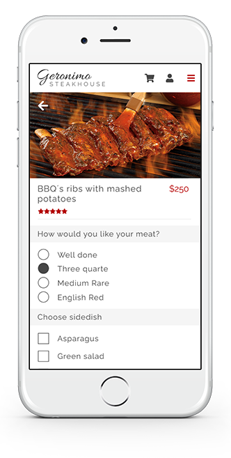
- Construct a detailed information page for each dish
The Problem
Busy executives and workers lack the time to prepare a meal.
The Goal
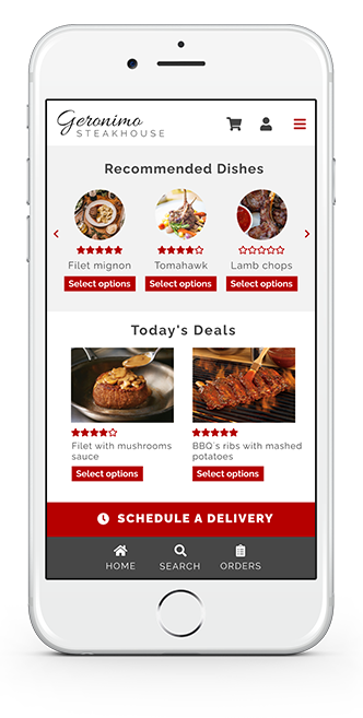
Design an app for Geronimo Steakhouse that allows users to easily order fresh, healthy and high quality dishes.
Starting Point - Users
I conducted interviews and created empathy maps to understand the users I’m designing for and their needs. A primary user group identified through research was working adults who don’t have time to cook meals but love a quality cut of meat.
This group of users confirmed initial assumptions about Geronimo Steakhouse customers, the research also revealed users wishes about what a delivery app should offer.
They are users who because of their hard work cannot go to a restaurant, so they take advantage of delivery applications to be able to order executive lunches or romantic dinners, so they must be offered an agile and easy-to-use system.
Pain Points
Time
Accesibility
AI
Other Difficulties
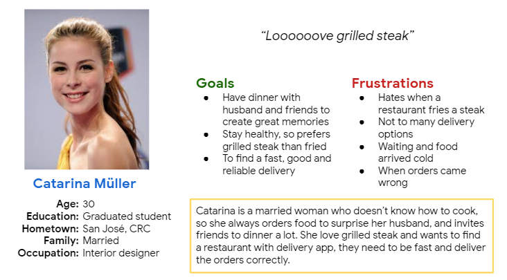
Persona
PROBLEM STATEMENT
Catarina is an interior designer who spends most of her day working and has no cooking skills, so she makes continuous use of food delivery apps.
“Loooooove grilled steak”
Catarina Müller
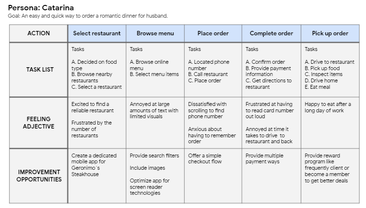
User journey map
Mapping Catarina’s user journey revealed how helpful it would be for users to have access to a dedicated Geronimo Steakhouse delivery app.
GOAL
An easy and quick way to order a romantic dinner for her husband.
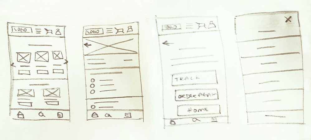
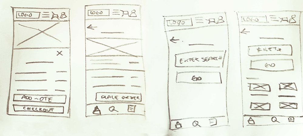
Starting the design - Paper Wireframes
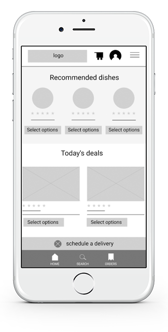
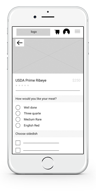
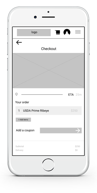
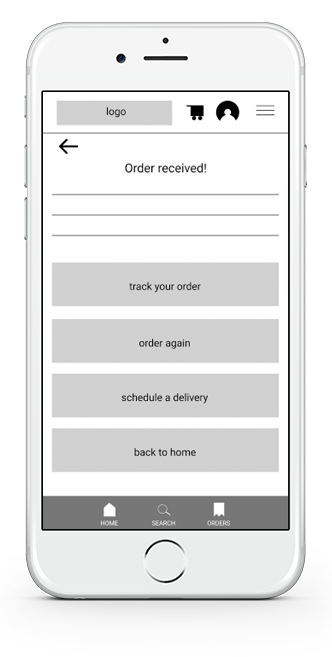
Taking the time to draft iterations of each screen of the app on paper ensured that the elements that made it to digital wireframes would be well-suited to address user pain points. For the home screen, I prioritized a quick and easy ordering process to help users save time.
Digital Wireframes
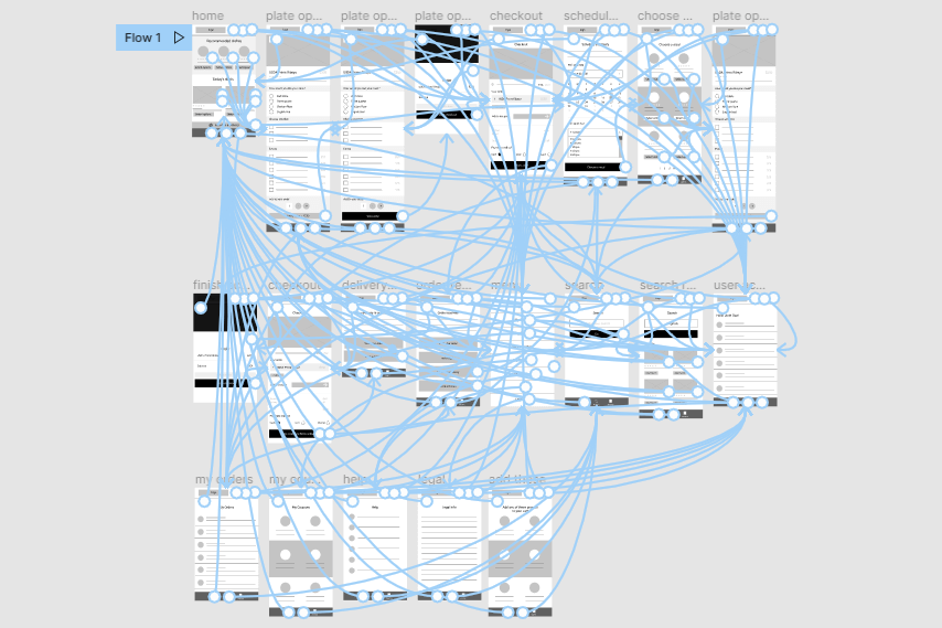
Low-fidelity Prototype Flow
Using the completed set of digital wireframes, I created a low-fidelity prototype. The primary user flow I connected was order a meal, so the prototype could be used in a usability study.
View the Geronimo's Stakehouse low-fidelity prototype
Usability study: findings
I conducted two rounds of usability studies. Findings from the first study helped guide the designs from wireframes to mockups. The second study used a high-fidelity prototype and revealed what aspects of the mockups needed refining.
ROUND 1 FINDINGS
- Users want to order a meal quickly
- The checkout process has too many unnecessary steps
- Users want a schedule option
- Users want to see other people rating
ROUND 2 FINDINGS
- Colors were not accesibles
- Menu options were hard to find
Refining the design - Mockups
Before usability study, the colors were not accessible, so the orange tone was changed to a darker red to help differentiate it, it also adds more elegance to the design and establishes a better graphic line for the product.
BEFORE USABILITY STUDY
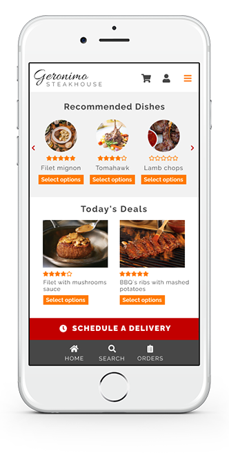
AFTER USABILITY STUDY

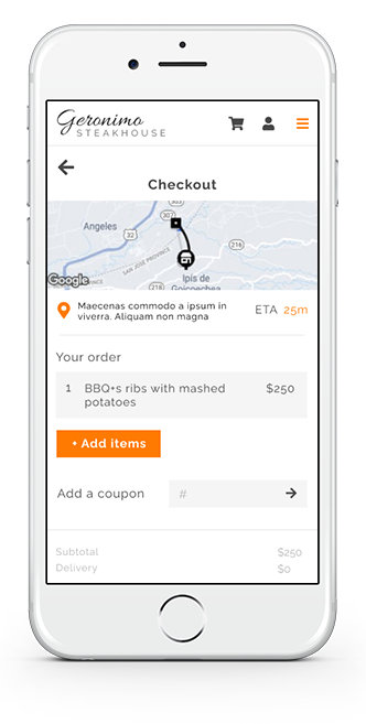
Users did not want to see additional or sale products before they could manage the checkout process, so that screen was removed so that the checkout process would flow and not be interrupted.
BEFORE USABILITY STUDY
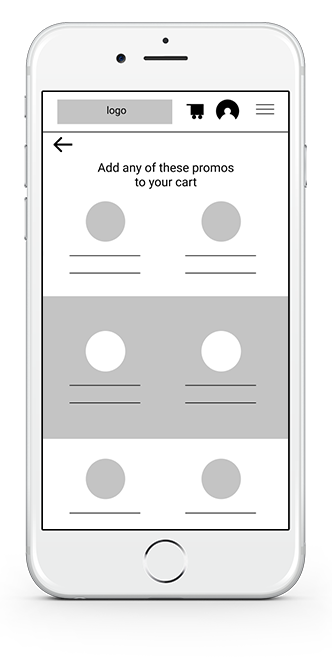
AFTER USABILITY STUDY

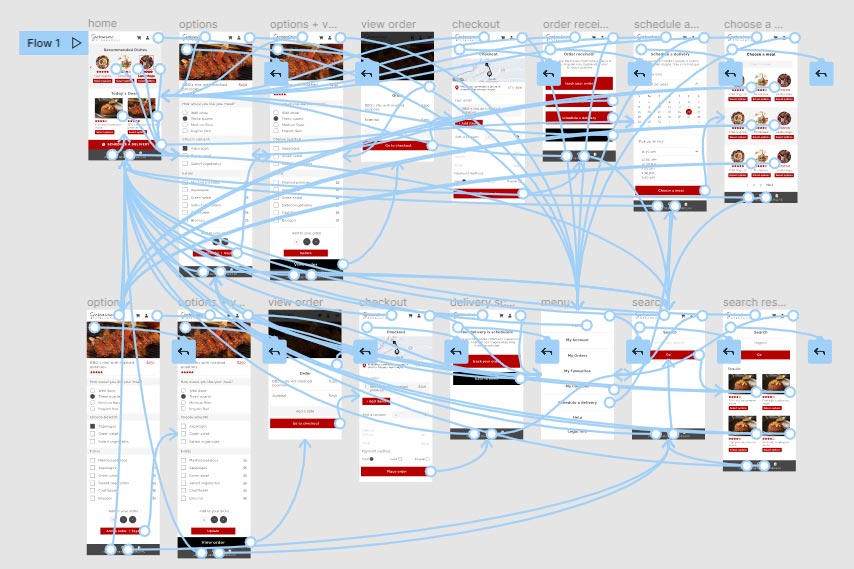
High-fidelity Prototype Flow
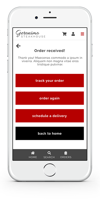
The final high-fidelity prototype presented cleaner user flows for select dish options and checkout. It also met user needs for schedule a delivery.
View the Geronimo’s Steakhouse high-fidelity prototype
Accesibility Considerations
Screen Readers
Navigation
Imagery

Going Forward: Takeaways
IMPACT
The app makes users feel like Geronimo’s Steakhouse really thinks about how to meet their needs.
One quote from peer feedback:
“I really like this app, it is easy to navigate and allows me to schedule a delivery, and I can see the rating that other people have given to the dishes, so I can get an idea of whether it is good or not, it is definitely an app that I would use.”
WHAT I LEARNED
While designing the Geronimo Steakhouse app, I learned that the first ideas for the app are only the beginning of the process. Usability studies and peer feedback influenced each iteration of the app’s designs.
Let's Connect!
Thank you for your time reviewing my work on the Geronimo’s Steakhouse app! If you’d like to see more or get in touch, my contact information is provided below.
Email: marisolmedrano@gmail.com


